A note on music and graphic design
Carl Bergstrøm-Nielsen, August 2000 - revised July 2017.
![]()

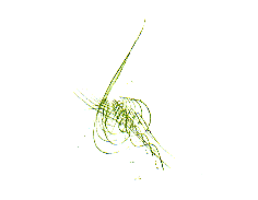
Take a look at this ... which associations does it evoke? - I get to think of vibrations, something one can physically feel, something alive connected to musical sound in a classical context.
So many graphic designs and logos employ treble clefs, quavers etc. and staves to symbolise music. At posters, brochures, logos for magazines and institutions, everywhere. So refreshing to see an alternative to this cliché. The example quoted above is taken from the Danish National Radio Symphony Orchestra and Choir's programme for 2000-2001.

The Copenhagen LYTNYT-calendar for contemporary and experimental music employs a similar idea, depicting an oscillogram - its style seems to be more of "buzzing with strong energy" (even if the oscillogram could also realistically be of something soft) than the first one.
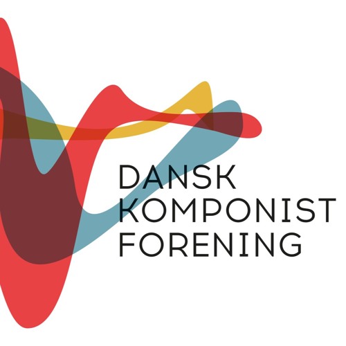 And such a visualisation is maybe in the process becoming more common. 2016, I think, Danish Composers' Society changed its logo into this...
This logo from International Music Institute, Darmstadt (Germany) employ the five staves in an unusual manner and avoid primitive clichés, admittently. The staves multiply, make spiral movements of several kinds into several directions. One could get an impression of something becoming very complex and pointing out into a vast universe, with something very structured at the basis. Well, it could also seem the outline of a treble clef is about to arise.

Here we have notes - but maybe they are not taken very seriously? The paper aeroplane could suggest that musicians like to play with the material. So, maybe, improvisation could be like critically commenting on the body of written music and something light, like flying, too. This was the logo for Tage neuer Musik in Weimar (Germany) 1993 with intuitive music as the theme, made by the advertising agency Klapproth & Koch.
However, treble clefs, staves and quavers belong to our old notational system. With its twelve steps within the octave and metric principles, it greatly reduces the auditive universe into stylised formulas. Electronic, improvised and other innovative musics did not accept these limitations. Being fond of these music forms and their wider universe of sound, it's natural for me to think of treble clefs contra vibrating strings and oscillograms the way I do.
But there is one more general aspect. The beauty of treble clefs, quavers and staffs (if they are so perceived) is an abstract and stylised one, based on mental ideas of what they represent and having an arbitrary connection between sign and reality. Vibrating and oscillating patterns seem to be a more direct, sensual representation of something perceivable, be it the life of a body or forces of nature. - Thus even for strictly classically orientated music listeners the violin logo shown at the beginning can serve to highlight the importance of the sounding reality and our awareness to it. It also, sophisticatedly, takes up the discussion about how to represent musical sound by depicting the violin strings at one end, lines looking like staves (although there are just four of them) at the other, suggesting that the dry symbols of writing are brougt to life in performance.
Back to Carl Bergstrøm-Nielsen